
Hi, I’m Tanner—a graphic designer.
I love any well-made design, but I’m especially interested in branding, print, and animation. When I’m not working, you can find me reading a book, printmaking, or learning how to play tennis. Thanks for checking out my work below.
︎Branding
︎Great Untranslated
︎Gamut Art
︎Stories from Letters
︎Azaloz
︎The Planets
︎Animation
︎The Crying of Lot 49
︎Keybird
︎UI/UX
︎Lexica
︎Info & contact
︎Résumé
︎Email me
Lexica
A social reading app to solve the problems of popular similar apps.

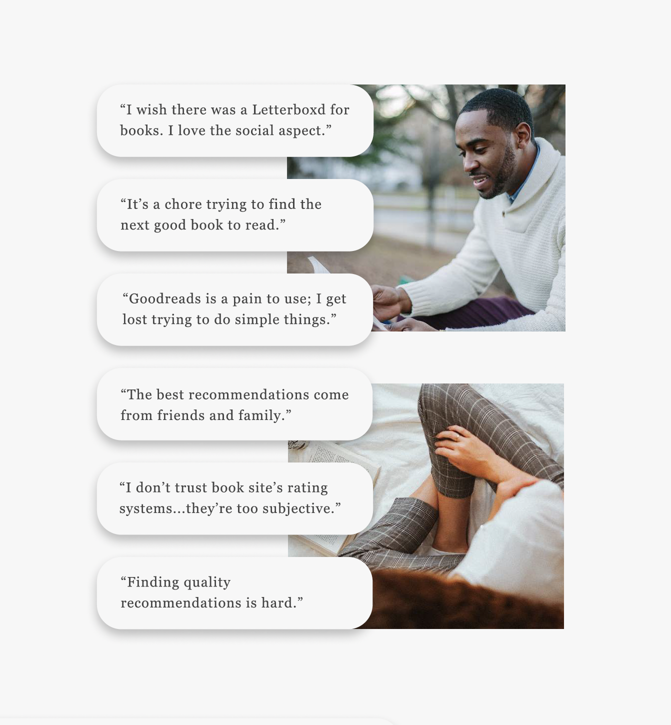
4,000,000 books were published in the US in 2020. With so many choices, readers are finding it harder than ever to sift through the mass of books to find consistent, quality recommendations. In addition, existing book apps, while functional, are often overdesigned and confusing for new users. LEXICA set out to address these issues by talking to readers.
In order to ground my app design in the goals and frustrations of real people, I conducted interviews with people in their 20’s who want to read more but don’t or can’t for whatever reason, hoping to discover how LEXICA could address their hangups.
Drawing from the interviews, I created a user persona, Ursula, to help guide the design of the app to address the most common problems and fulfill the most common desires. Next, taking the user persona one step further, I imagined what journey Ursula might take to find her next book after finishing one and how LEXICA could address her desires and concerns to ensure the process is smooth and simple.


Paying special attention to the User Persona and User Journey, I diagrammed a site map to clarify how the app is organized and how best a user could navigate it. After this, I expanded the sitemap into wireframes, prioritizing negative space and ease of use.


Finally I began designing the app based on the wireframes. In this stage the visual language was solidified with two main goals: (1) prioritize negative space, (2) emulate the page of a book.
The first goal was based on user interviews in which people expressed dislike at cluttered and confusing design in book apps. The second goal, besides being thematically appropriate, ensures the pared back design never becomes boring. The mix of serif and sans–serif fonts add visual interest while differentiating content.
The first goal was based on user interviews in which people expressed dislike at cluttered and confusing design in book apps. The second goal, besides being thematically appropriate, ensures the pared back design never becomes boring. The mix of serif and sans–serif fonts add visual interest while differentiating content.


